CASE STUDY
3 min
ROLE
Lead Product Designer (Intern)
TOOLS
Figma, UserTesting, Figma Slides (For presenting to leadership)
TIMELINE
5 Weeks, 2024
Overview
TL;DR
$20M in value—and that's annually.
Tested and proven in 5 weeks.
% of CarMax' Net Income (FY 2024)
0%
0%
% Increase in Inventory Throughput (KPI)
0%
0%
CarMax was losing ~$11.8 million a year from vehicle inspections. This was an intern-led initiative to explore a solution in only 5 weeks.
I led all aspects of design to prove out this product—every UI deliverable and design process artifact you see here was produced by me. Not only did I find an elegant solution, but proved it to leadership (up to the VP-level) and secured buy-in from all stakeholders.
As the sole product designer on this project, I worked closely alongside the product manager intern to imagine a new inspection system under a lean, product-led approach. But achieving our high-impact goal in this timeframe still meant high-frequency, intensive collaboration with process engineers, developers, users, and other designers.
Despite not having any researchers, collecting data to prove my concept worked was a non-negotiable, so I ensured rigorous, iterative testing was a core part of our strategy.
HIGHLIGHTS
Give mechanics something so good they'll never go back.
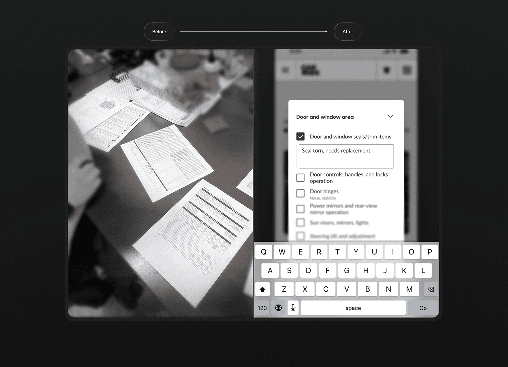
figure 1.1: From paper to digital
A single app instead of a bunch of inspection sheets
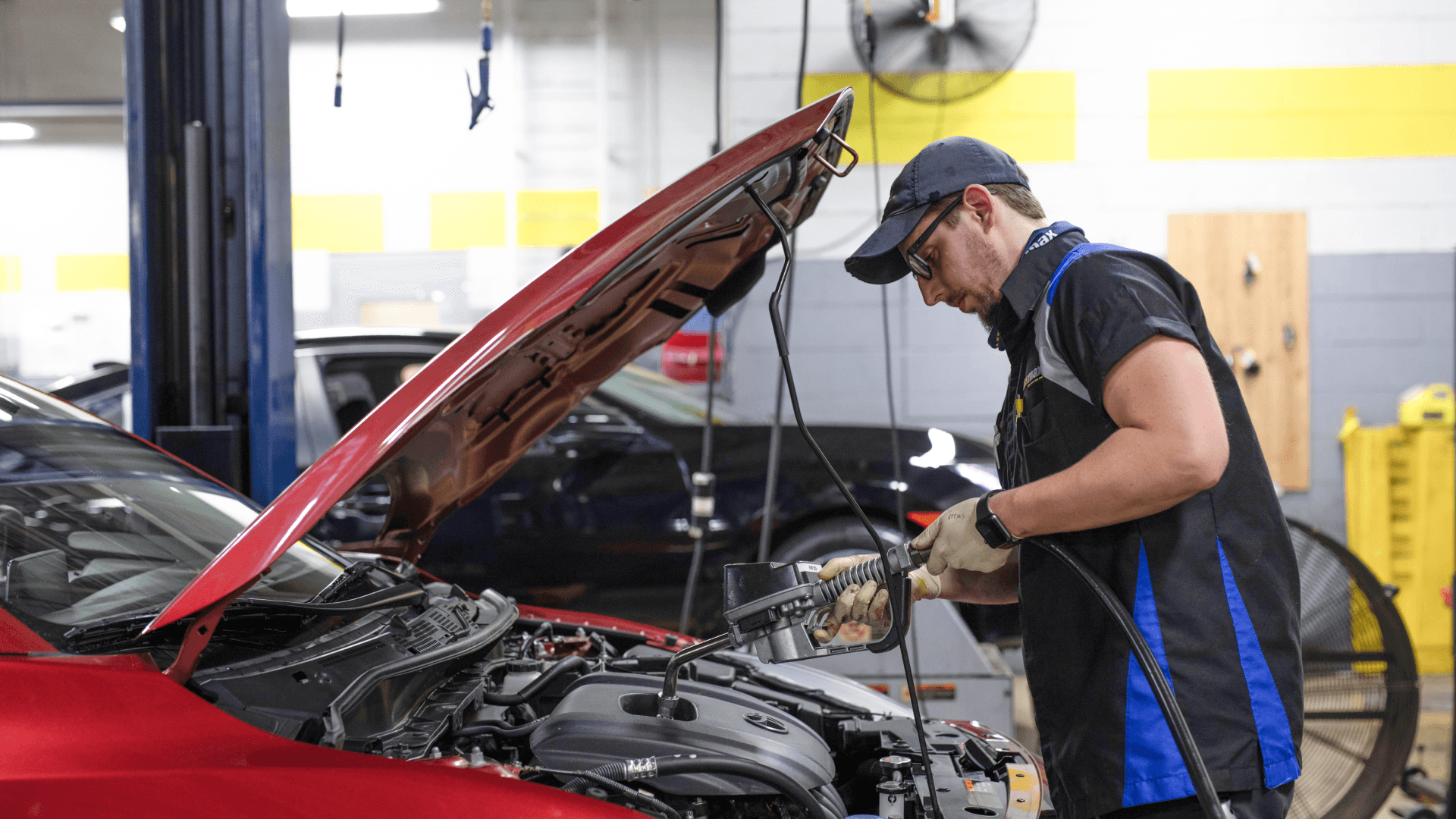
CarMax mechanics have been following lengthy paper checklists forever—the majority of their problems and inefficiencies could be attributed to how long things took to find, how long they took to write, and miscommunication from simple things like poor handwriting.
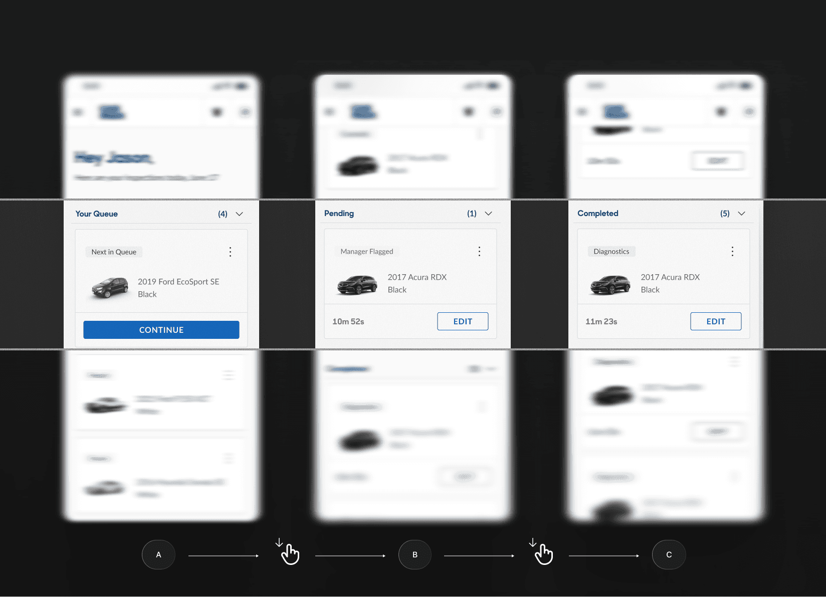
figure 1.2: VEHICLE QUEUES
Vehicle queues made mechanics feel in control
Giving them a clear outlook of their day removed guesswork and reduced bottlenecks, allowing them to quickly see what's next (Figure 1.2A), what's blocked (Figure 1.2B), and what's done (Figure 1.2C).

HIDE ANNOTATIONS
figure 1.4: checklist
A checklist that's so obsessively-optimized that inspecting 128 items feels like only a fraction of it.
99% of mechanics would actually just skip all of their checklists and write any issues in a comment box. Everything that makes this checklist "good" was intentionally thought of—from the architecture down to the writing.
figure 1.5: visual checklist
A digital checklist that matches the actual workflows of the physical world
Mechanics inspect cars by looking at cars, not words on a screen.
It might take a them 15 seconds to find something on a list, but if they’re already looking at it in a car, the visual checklist I came up with (Figure 1.5) makes that intuitive and significantly reduces a user's time on task.
Mistakes happen, but we have to fix them and hold mechanics accountable without slowing them down.
This lets mechanics document issues from any point in their process, even if they missed it at first. (Figure 1.6)
And instead of being required to verify every item, mechanics confirm their inspections at the end. (Figure 1.7)
figure 1.6: documenting issues
figure 1.7: VERIFYING INSPECTIONS
KEY CHALLENGE
If I don't advocate for end-users. Who will?
Our process engineers and legal teams have always required mechanics to verify the status of every item—a huge time sink. Mechanics already had workarounds with paper, so I was concerned that forcing them to do the same thing on an app would be a huge adoption risk.
It was up to me as the designer to explore all possibilities and find common-ground for all stakeholders to make sure the product met our end-user's needs.
TESTIMONIALS
I have more than numbers and a validated prototype; here's what others thought:
GALLERY
Outcomes speak for themselves, but the path wasn't linear. Here's proof.


Multiple rounds of user interviews, design jams, and whiteboarding
It took dozens of interviews and whiteboard sessions to land on Mechanical Inspection—our most complex, high-leverage focus.
You probably can't tell what's going on in every image here, but reach out if you want a more in-depth story.
Meticulously-tested. Every second I could shave off inspections adds up at-scale.
The prototype was so effective by the final round that it could fully replace their existing worksheet workflow without a single miss.
Developing hi-fi prototypes were critical to test interactions: everything from the visual checklist to how comments were written.
I also explored the details, including variations in UX writing and even fine-tuned the order of each inspection step.


RETRO
Proving what's possible in 5 weeks.
The biggest challenge in this project was the timeline. With just a few weeks, I had to work fast—but without sacrificing thoughtfulness. That pressure gave me deep reps across the product cycle and forced me to focus only on the work that could be tested, learned from, or improved.
It also meant every iteration had to count. I made a habit of extracting value at each stage—talking to users, validating flows, tuning language, and tightening decisions. There wasn't time to overthink, but there wasn't room to be sloppy either.
This project taught me how to move quickly and deliberately. It was a sprint, but it set a standard.
With some more time…
The prototype validated viability, usability, and desirability.
While the team started to explore feasibility in regards to device compatibility and repair order integration, it would have been nice to explore how other stakeholder interfaces would work with this system.
We also surfaced ideas for the future: speech-to-text, performance tracking, customizable flows, and photo capture. Ambitious—but out of scope for now.
BONUS
What else I did at CarMax…
figure 2.0: MyCarMax
Helping customers go from test-drives to the right purchase.
My other project was for MyCarMax, where customers are able to track their shopping progress. I designed multiple validated components, as well as AI concepts to help customers find the right cars and move them farther down the test-drive-to-purchase pipeline.