TL;DR
$20M in value—and that's annually.
Tested and proven in 5 weeks.
CarMax was losing ~$11.8 million a year from vehicle inspections. This was an intern-led initiative to explore a solution in only 5 weeks.
I led all aspects of design to prove out this product—every UI deliverable and design process artifact you see here was produced by me. Not only did I find an elegant solution, but proved it to leadership (up to the VP-level) and secured buy-in from all stakeholders.
As the sole product designer on this project, I worked closely alongside the product manager intern to imagine a new inspection system under a lean, product-led approach. But achieving our high-impact goal in this timeframe still meant high-frequency, intensive collaboration with process engineers, developers, users, and other designers.
Despite not having any researchers, collecting data to prove my concept worked was a non-negotiable, so I ensured rigorous, iterative testing was a core part of our strategy.
ROLE
Lead Product Designer (Intern)
TOOLS
Figma, UserTesting, Figma Slides (Presenting to Leadership)
TIMELINE
5 Weeks, 2024
% of CarMax' Net Income (FY 2024)
0%
0%
% Increase in Inventory Throughput (KPI)
0%
0%
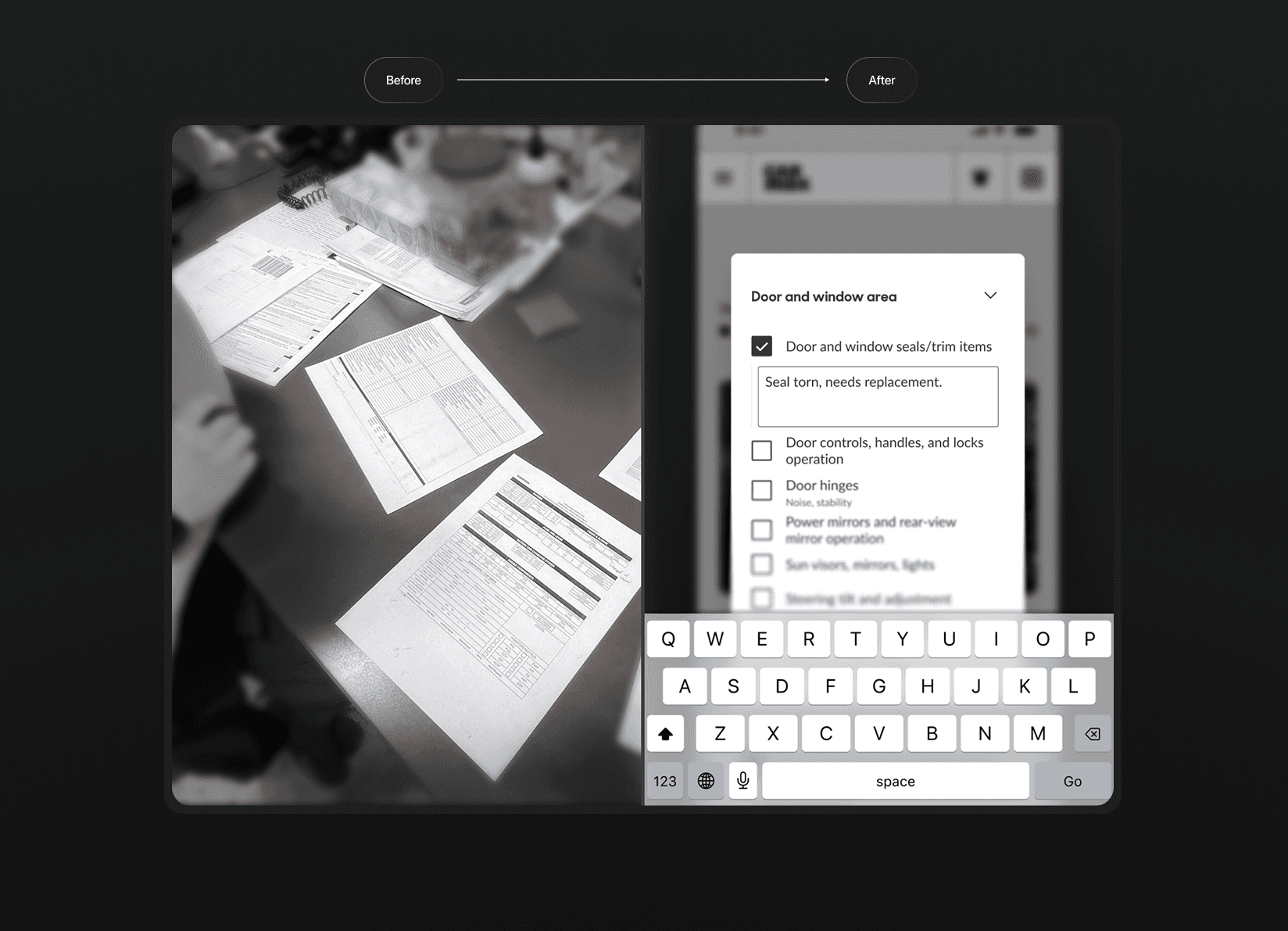
A digital checklist that matches the actual workflows of the physical world
A single app instead of a bunch of inspection sheets
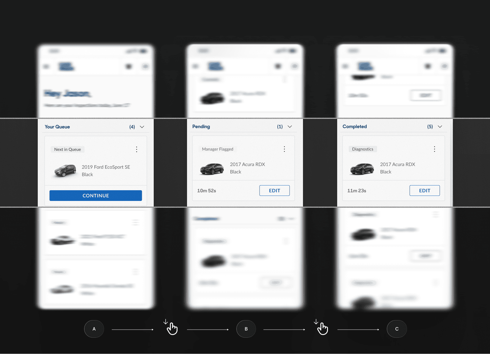
Vehicle queues made mechanics feel in control
A checklist that's so obsessively-optimized that inspecting 128 items feels like only a fraction of it.
